Monday, April 4, 2016

Create a Simple Mock-up Using Canva


As a graphic designer I am always making mock-ups for my clients, and to showcase my work in a real life setting using Photoshop. But I know that everyone doesn't have access to Photoshop, and so I wanted to see what I could create in Canva that could provide you with the same or similar effect.

So I've written this tutorial for those of you that wish to showcase your artwork and designs without having to use a paid program.

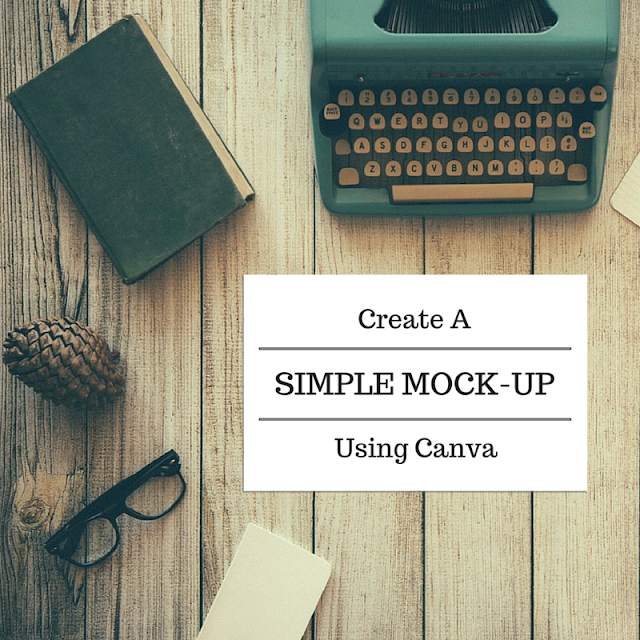
Create A Simple Mock-up Using Canva

Open Canva and select your layout size, I used the Social Media layout for this tutorial.


This will work best with a flatlay image, preferably one with space where you can add your design. Go to uploads and upload the images you will use.


Re-size your image so it fits nicely in your layout moving it around accordingly so you have room for where your design will go.


Now that you have your background image set, it's time to add the "mock-up" portion of your design.

Go to the Elements tab on Canva and select your shape, in this case I selected a square with sharp corners as I wanted my mock-up to look like a paper laying flat on the desk of my background image.


Once you select your shape it will appear on your canvas.


Re-size it to fit in the clear space of the background image. 


Now you can change the color to a dark grey, this will end up being the shadow for your mock-up. Play around with the color until you find one you like.


Now change the transparency on it. Again play around with it until you find a shade that works well with your image.


I set mine to 50%. You can always go back and change it later if you don't like the way it looks once you add the other elements.


Go back to the Elements tab and add another square shape.


Shape it to where the top and right side (or left, depending on where you want the shadow to fall) is aligned with the grey layer, but make sure that the grey peeks outs from the other 2 sides as shown below. This gives it a slight shadow effect and making it look more realistic. If your "shadow" is to dark or too light go back and change it by adjusting either the color or the transparency.


Now you can add text to your design.


Like so. Canva has many free options for text effects, play around with them until you find something you like.


If you're adding art to your canvas go back to the Uploads tab and upload the image you want to add here, in my case I added a pre-designed logo.


Re-size it so it fits properly in your canvas. And you're all done!


You can then save it and share it! The great thing is you can always go back and use the same layout for other designs.


I hope you enjoyed this tutorial. If you have any tutorial requests please feel to make suggestions in the comments!

If you want to learn more about graphic design and printing please join my Facebook group The Life of a Graphic Designer!

If you need professional graphic design help, please check out my website at www.corpimg.net to find out more about how I can help you and your business.

Love,


Monday, March 28, 2016

Designing a Moodboard


Moodboards, vision boards, inspiration boards... I'm sure you've heard of one or all of these terms, especially when it comes to establishing your brand's visuals. So what exactly is a moodboard, why do you need one, and how do you even go about creating one? Let's find out!

WHAT IS A MOODBOARD?

A moodboard does just what it says: it sets the mood for your project with the use of photos, colors, typography, textures and patterns. All these items together will help you, or your client, get a better sense of the direction you want to go when it comes to your design. They ca be used for logos, a brand or rebrand, a website, interior design, etc., the possibilities of it's many uses are endless.

As a designer it helps to keep me on track by providing a visual point of reference throughout the design process. If I'm working with a client, I involve them in the process, this way i know we are both on the right page, and if they like the moodboard it's very likely that they will love the finished design whatever it may for.

Keep in Mind: The idea behind a moodboard is not to copy design elements right from it but to figure out what design aesthetic you are most attracted to and use that as inspiration for creating your own visuals.


WHERE TO FIND A MOODBOARD TEMPLATE?

You can do a quick google or Pinterest search to find plenty of free templates. You can also find them in Canva for a small fee or you could save an image of one and upload it as a Canva background, and use it as a foundation for you to add images on top of.


HOW TO CREATE A MOODBOARD?


Step 1: Gather Images

My favorite way to gather images for a moodboard is through Pinterest. You can search for images featuring any color, pattern, texture, font style, photographs, etc. and pin them to a board.

A lot of times, especially when you are not 100% sure of the direction you want to go, you'll be able to see a pattern emerge in your pins. Gather anywhere from 15-30 images and this will lead you to the next step.

Step 2: Eliminate

Go over all the images you have collected and start eliminating that ones that aren't a perfect fit. Pick out 1 or 2 of your favorites, the ones that have ALL or close to all the elements that embody the look and feel you wish your board to have. Then go through the rest of the images keeping the ones that have that same feel in style, colors, patterns, etc., and remove the rest.

Also keep in mind the layout of your moodboard, be sure to save images that are vertical or horizontal so you have a variety to pick from when doing the final layout.

Step 3: Organize

Now it's time to organize all those images. First you'll notice the colors, and depending on the moodboard you've chosen, select between 3-6 colors that stand out the most from your images.

Then start moving your images around. Place paint chips next to photos and texture next to flat color blocks, just keep moving them and organizing until you find an overall layout that you like.

If you find an image that just doesn't sit well with you, it probably doesn't belong, always follow your gut, it's usually right.

Step 4: Save and Share

Now that you're done with your moodboard, save it and share it on Instagram, Pinterest, or on your blog. They are a lot of fun to design and very simple to put together!


Design Prompt #003 - Designing a Moodboard

This week I want you to create a moodboard for your brand, or any other project that you are currently working on and share it with the group.

If you are a creative boss that wants to learn some basic graphic design skills, join my Facebook group (The Life of a Graphic Designer) to get design tips, tutorials, and advice on everything relating to graphic design and printing as it pertains to your business!

Hope you enjoyed this tutorial, and I'll see you next week with more design information you can easily apply to your business today!

Love,


P.S. If you are in need of professional graphic design work, please feel free to visit my website at www.corpimg.net!

Monday, March 21, 2016

Font Pairing Like a Pro


Before we get to the fun stuff we need to understand some typography basics. So let's talk about what typography is.

What is Typography?

Typography is an art form that has been around for hundreds of years. Words and text are all around us in just about everything we do. For each different type you see, somebody has considered how it will look, feel, and be read by us. Most of the time it is us graphic designers implementing their use, so the better we get at it, the more effective our designs will be.


Good typography is all in the details, as they can make the difference between good design and great design! It's not just about choosing fonts and making copy look good, it also needs to be legible, and readable, in an aesthetically pleasing way.

Typeface or font?

Designers are often unsure of the difference between the two because they are both terms used to represent the same thing. A typeface is a family of fonts (i.e. Helvetica Regular, Helvetica Italic,  Bold, Black, etc.) meaning what you SEE. A font is a specific weight or style within a typeface family (i.e. Helvetica Regular, 

Let’s get this one cleared up straight away! Designers are often unsure of the difference between these two, as they are both well used terms for the same thing. Actually, a typeface is a family of fonts (such as Helvetica Regular, Helvetica Italic, Helvetica Bold, Helvetica Black, etc.) but a font is one weight or style within a typeface family (such as Helvetica Regular, Brandon Groteque Medium, etc).


Typeface Classification

There are many classifications and sub-classifications for typefaces, but the most common ones are serif, sans-serif and script.

Serif: these are more traditional and are distinguished by a short line on the end of each character stem.

Sans-serif: are distinguished by their lack of serif.

Script: you can easily recognize these fonts as they are look handwritten and very fluid.
There is much more to be learned in the art of typography, but we'll save that for another time. You have what you need to start learning about font pairing!

Font Variety

I recommend using no mare than 3 fonts per design project. Too many fonts will confuse your audience and make the design look messy.

Font Pairings

Now that you understand the basics of fonts, let's talk about pairing options: 
  • You can pair fonts from different font families or
  • You can use different weights to create visual contrast between two fonts in the same family.
Pairing Fonts in Different Font Families

Now mind you, it can get more complicated than the formula I'm about to give you, but for the most part this will help you create some kick ass font pairings!

Choose a font from one of the three categories: serif, sans-serif or scrip. To find a good font to pair it with, just pick a font from any of the other two categories, minus the one you just chose.

Did you think we were done? Not quite yet! Determine the weight of your primary font. If your font is heavy in look, opt for a complimentary, thinner font. This will give it contrast, and as you learned in the last lesson, contrast is a basic element of good design, and will create visual interest for the viewer.

Pairing lighter weight fonts with round typefaces will have a less dramatic feel but can still be appealing.

If your text feels a little confined, or even suffocating, try increasing the spacing across the entire word, this is called tracking.

Paring Fonts in the Same Font Family

Choose a serif or sans-serif font that comes with at least 2 font weights or variations (i.e. regular, bold, thin, etc.). Try different combinations that will provide contrast from heavy, bold weights paired with light, or regular weights.

I recommend staying away from pairing this category of fonts together in different weights.

Finding Fonts

So now that you know how to pair fonts, where do you find fonts you can use? There are tons of font on the internet, some are well designed fonts, and there are others that only belong in the hands of a 7 year old writing a poem about unicorns lol. Design isn't the only thing you should be concerned with, user license should be taken seriously.

As a safe bet you can use Google Fonts, as well as Fontsquirrel.com, both offer quality fonts that are approved for commercial use. Another great place to get your fonts from is Adobe Typekit and if you already have a Creative Cloud subscription access to all these fonts is included in your monthly payment.

Wherever you decide to get your fonts from, make sure that you read the license agreement. If it states "personal use only" keep it to just that. Most will have the option to buy a commercial use license and those can vary greatly in price depending on how many font families are included and who designed them.

Design Prompt #002 - Font Pairing

This week I want you to use your business name, or come up with one that contains two words, and create 3 font pairings, but here's the catch, each one has to be a completely different style! Such as: classic, modern, vintage, formal, grunge, retro, etc. Post it in "The Life of a Graphic Designer" Facebook group and tell us which 3 styles you chose along with an image of your font parings. I'll give you freebie and let you turn in your logo as one of your submissions, unless your logo only has one word. Then you have to come up with a third, like I will be stuck doing hahaha.

If you are a creative boss that wants to learn some basic graphic design skills, join my Facebook group (The Life of a Graphic Designer) to get design tips, tutorials, and advice on everything relating to graphic design and printing as it pertains to your business!

Hope you enjoyed this tutorial, and I'll see you next week with more design information you can easily apply to your business today!


Monday, February 8, 2016

Burgandy, Grey and Black Moodboard Monday

Moodboard Monday is here again and we're just a week away from Valentine's Day, and my birthday! Woot! Although I am definitely not looking forward to getting older, this year has started off great for me and I can only hope that it continues to be.

So for this week I went a little darker with the colors; a big contrast from last weeks moodboard.


Here are the links for the items featured:

Blankets: Pottery Barn
Violin: Unknown
Kitten: Inspiration Lane
Suit: Victor Valentine
Yarn: Knit Picks
Card: Line Doodle Designs

And of course the colors:
Burgandy: #51030b
Grey: #8c8c8c
Black: #090909

So there you have it! A deep, dark color palette perfect for Valentine's Day! Enjoy :D

Monday, February 1, 2016

Soft, Valentine Pink and Beige Moodboard

Moodboard Monday is here and I am totally feeling excited about February! Not only because it's my birthday month, but the Aquarius vibes are totally flowing and I'm feeling it!

So to get in the mood I designed this soft and pretty moodboard for your viewing pleasure :)


Puffy heart: (if you know the owner of this image, please let me know)
Pillow Stack: This Ivy House
Bedding: Anthropologie
Bracelet: Chan Luu
Geometric Candle Holder: Waen

And of course the colors:
Beige: #c5ac91
Blush: #eedad6
Pink: #fac0c7

So there you have it! A beautiful, soft color palette to kick off this month of LOVE! Enjoy :D

Thursday, January 28, 2016

Top 6 Business Card Mistakes To Avoid

Top 6 Business Card Mistakes to Avoid

A business card is so important, and because it's such a cost-effective marketing tool, it should not be overlooked! Too often it's a missed opportunity to make a great first impression. 


There's always a chance that if the look of your card is cheap or unprofessional, that it may be thrown in the trash, along with your chances of acquiring a new client. Why risk it with the cost of printing business cards so affordable?

You don't need to be a professional designer to come up with a good business card, but you should know these common mistakes to make it an effective marketing tool.


Mistake #1: Blending In

The majority of business cards out there leave no real impression and shortly there after get thrown in the trash. Leave someone with a card that looks great and feels great, and I promise you won't be forgotten.

There is absolutely no excuse for an unattractive or unprofessional looking business card. With so many free templates, software templates and well designed samples available online today to help you, there is just no excuse.


Mistake #2: Poor Quality Card

I've had clients show me business cards they printed themselves, or even with some online printing companies. At first glance they look fine, but when you hold the card in your hands you can quickly determine it's value when you realize they are flimsy and you can feel the perforations around the sides, which sometimes even start to peel back.

Don't skimp on quality when it comes to business cards. You want to have a good paper stock, print that doesn't bleed, and the card should feel substantial and pleasing to the touch. I wouldn't recommend anything under 14 points, and if you can get 16 pt, even better.


A poor quality card implies poor quality services or products, so instead of attracting potential clients a poor quality card will likely repel them. If you don't give your business card out as much, then spending good money on them shouldn't be a problem as they will last you a long time. If you give your card out on a regular basis, then you definitely need to invest in good quality cards as they will result in plenty of leads and well worth the expense.


Mistake #3: The Mystery Card

When someone looks at your business card, can they tell right away what you do? If you're answer is no, then you are very likely missing out on plenty of calls and referrals.

Your card should state at least one very powerful reason a customer should do business with you. If you're logo and/or slogan doesn't cover that, you may want to consider adding a bit more information.

Mistake #4: The Oversized Card

Common sense dictates the use of a traditional 2" x 3.5" business card. Anything bigger will not fit properly in wallets or business card holders, and chances are it will end up in the trash.

The same applies with cards that are too thick. 32 points is about the thickness of a credit card, and I don't know about you, but when I put two credits cards in the same slot in my wallet I kick myself in the butt every time I have to struggle to pull one out! Is it really worth stressing out your potential client over a trend? Probably not lol


Mistake #5: Small Print

Is your print so small that you should be handing out magnifying glasses with your business card? Consider the fact that most people over the age of 35 require reading glasses and use that as a guideline for type size. Don't go smaller than 7-8 points on the overall design, your name can be a little larger, at least 9 points. And your logo/business name usually looks good at about 12-15 points. It all varies on design of course, but keep it over 7-8 points.

Mistake #6: Clutter

I know you may want to put as much information as you can on your card, but that's what your website is for or your phone number, so you can tell people all about how you can help them! Too much print looks busy and terribly unprofessional. Keep it simple and make sure they know how to reach you. All that is really needed is your name, your company, what you do, and how they can contact you.

Always have a supply of cards wherever you go and give them out when appropriate. Give out more than one and invite people to pass the extras along to others whom they may feel would benefit from your services or products. You'd be surprised at how often this can result in referrals and possibly new clients.

So there you have it, 6 simple mistakes to avoid. Now there are alway exceptions to the rules. Knowing the reasons behind these common business card blunders will help you determine if in your specific line of work it will be okay to break them. 

If you have any other questions about business card designs or printing in general, feel free to ask in the comments section. And if you need assistance from a professional, head over to Corp.img and we'll do our best to help you with your project!